
I hopped over to the Tate Modern last Friday after a visit to my optician in the City, when I finally succumbed to the need for multi-focal glasses. Age: can’t read the newsprint these days without taking the glasses off.
Anyway, afterwards I strolled down to the Millennium Bridge and made my way to the Roy Lichtenstein retrospective. Like a lot of people, I imagine, I just thought of him as a rather humorous painter of large comic strips. Fun, but not much more.
But the paintings on show changed my view.
It’s funny, after seeing the exhibition, I read a few reviews online. The piece in the Guardian (my favourite paper) praised the first few rooms, which expanded on his cartoon stuff, and then said it went downhill. For me it was completely the opposite. I didn’t need to see pictures of Donald Duck and Mickey Mouse or fried eggs, but I was fascinated by the homage Lichtenstein paid to other artists.
So the exhibition really got going for me in room 7, which was called “Art About Art”. There were a series of paintings which took the work of Picasso and related artists, stripped them down and built them up with Lichtenstein’s powerful lines and colours, and in some cases the dots of varying sizes, that give a sense of light and shade. Here are a few examples based on Picasso – which don’t use the dots too much but convey the essence. They are infused with humour, as ever with Lichtenstein, but also with respect for the artist.
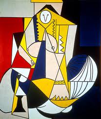
‘Femme d’Alger” here represents Picasso’s “Women of Algiers”.
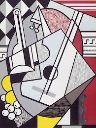
This one makes cubism bright and lively.
And this one is pure Picasso from his twenties series of nudes on the beach.
Simplified.

I liked this triptych, too, that rather affectionately showed how you could move from a fairly conventional painting of a woman’s head, through cubism to the most abstract representation possible.

There was also what I thought was a very beautiful take on Monet’s series of Impressionist views of Rouen Cathedral. A work of art in its own right. There was a real intricacy to the use of the dots and shadows in these paintings. Only one way to appreciate them – go see!

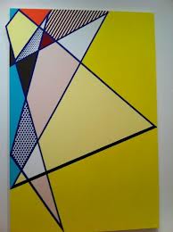
There was colourful room called “Perfect/Imperfect” for all the geometrists out there.
That was followed by a room of “Late Nudes”. A real sense of fun here, a kind of parody of the conventional. But also a weird sense of sixties America, even though the works were from the nineties. And the dots came to the fore in these works.


Finally, maybe the best of all, Lichtenstein’s Chinese phase, in which he followed the classic forms, with their emphasis on simplicity. A lovely landscape and just a hint of branches, or a person or boat.


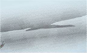
And in this one, the splurge of fog over the pointillist scene.

Not what I was expecting at all, and so much more than I was expecting. You might go and just love the classic Lichtenstein cartoons and comic strips. They are very enjoyable. But the new angles made the exhibition for me.
And as ever, there is nothing like seeing them right there, right now. To see what they do to your senses when they are right in front of you.
Because we all perceive in different ways.
All the pictures are from Google Images.

Now, that is something I would like to see.
I think it might be touring, but not sure where. Sorry, not very helpful!
Excellent works! They must be fabulous in real life.
I really enjoyed it, having not really expected to.Of course you can’t beat viewing from a distance to get the perspective and then looking right up close to understand the technique. And reproductions in books or on-line never quite capture the real colours. So yes, real life is always the best!
Pingback: I’m in London! | Alternative Inspiration
Pingback: TateShots: No Soul For Sale | mostly music